In the IP & Resistivity extension of Oasis montaj, you can now find more tools for enhancing visualisation of electrical data from IP surveys. Discover what’s new in the below video, or further on in this blog.
Not using the IP & Resistivity extension for Oasis montaj? Request a trial.
Show Contributing Electrodes in plan maps and 3D views
The new ‘Show contributing electrode’ button allows you see the plot point of the row selected along with the receiver and electrode positions for all types of IP survey configurations.
As IP surveys become more data – rich with significant duplication and redundancy it is difficult to visualise the location of electrodes in a data view. This new tool highlights contributing electrodes to the plot point and makes the background transparent.
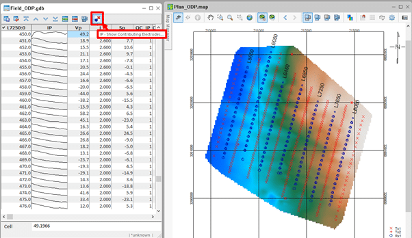
Figure 1: The Show Contributing Electrodes option is shown at the top of the database window
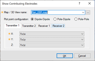
Figure 2: Set the Map or 3D view and the Plot point configuration for 2,3 or 4 electrodes
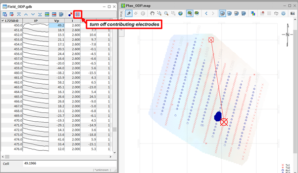
Figure 2: Set the Map or 3D view and the Plot point configuration for 2,3 or 4 electrodes
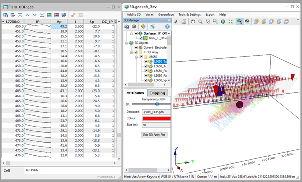
Figure 4: Show contributing electrodes and the plot point in the 3D view.
Show noisy decays
This new QA/QC tool fits the IP decay to a specified polynomial along the decay to identify and mask noisy IP data in the QC_IP channel. Set % fit errors to evaluate the difference between the measured and trend decays and mask windows outside of the range. Set Mask QC_IP threshold to mask the QC_IP channel when most of windows are outside of the error range. Use the Display interactively tickbox to cycle through the decays and show the effect of the fit and observed decays. You can also have the Show contributing electrodes option selected to show the plot point of the decays as you cycle through.
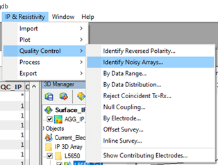
Figure 5: The Identify Noisy Array tool
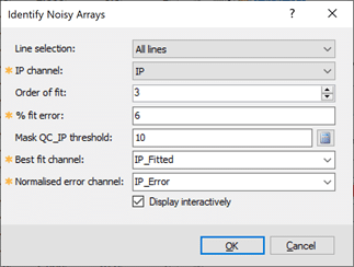
Figure 6: Set the % fit error based on variability in the survey data.
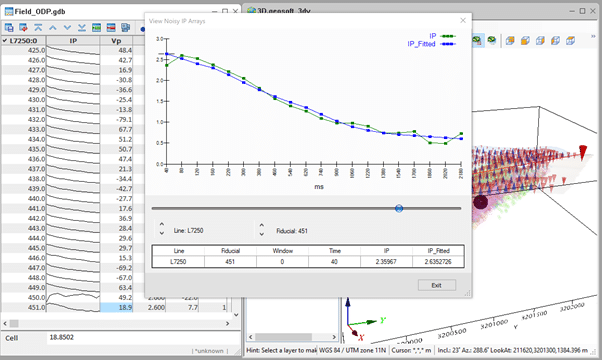
Figure 7: Cycle through individual decays with the interactive viewer when the Display Interactively option is selected.
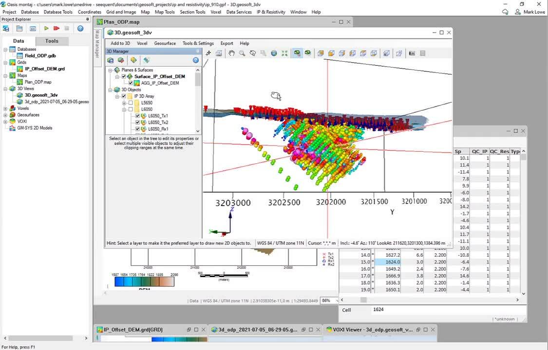
Enhance and group data in 3D array plot
New options in the 3D array plot tool allow you to view the plot point data by proportional size and colour. This is useful to reduce low-amplitude features and enhance high values. New grouping tools automate grouping by type (transmitter, electrode, measured property) or by line. Use the toggle options in the 3D Manager to then rapidly switch view of type or line data to identify anomalous data values for further processing.
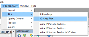
Figure 8: The 3D Array Plot option is especially useful for offset 3D configurations
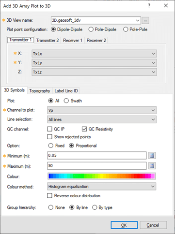
Figure 9: Set to show proportionally sixed symbols and arrange symbols by line or by type
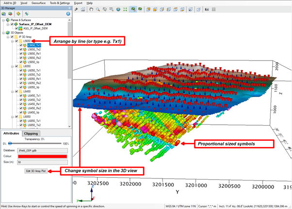
Figure 10: Arrange by line or type in 3D Manager and change 3D symbol size with the Edit 3D Array Plot option
Mask by multiple data ranges
Use expressions within the Data Range QC tool to mask by multiple channels of interest. Set And/Or arguments and mask outside or inside the data ranges using the calculated properties in the Data Statistics.
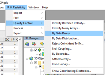
Figure 11: The Data Range tool can be used to window data based on statistics for multiple channels
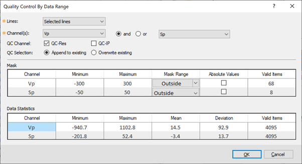
Figure 12: Specific multiple channels and apply the data range mask or absolute options
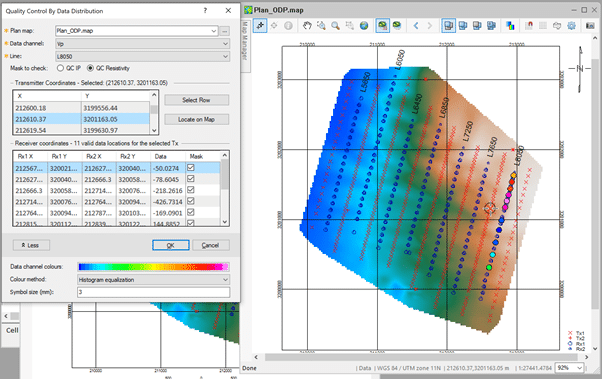
Mask on Data Distribution
Use the new Data Distribution tool to analyse data based on transmitter location and plot point value. Select the transmitter location by row or interactively by selecting locations on the map. Mask out noisy data points outside of the expected distribution within the tool window to update the QC_IP or QC_Res channels.
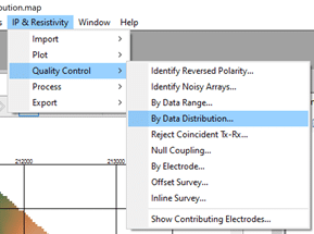
Figure 13: Find the new Data Distribution tool in the Quality Control menu